For many companies, having a form on the homepage can be very useful. The types of forms that are useful on a homepage include, ‘Schedule a Tour’, ‘Guest List’, ‘Sign up for our Newsletter’, ‘Get a Quote’, ‘Price Calculators’, ‘Log In’ and so on. However the major rule behind what type of form should be on the homepage is that it MUST BE SIMPLE. No one wants to land on a website and be greeted by a form with tons of fields to fill out. The trick is to make the form seem as simple as you can and non-committal. Many times a form on the homepage is just a teaser or a means to collect the visitor’s email (aka a guest list or mailing list form). Getting a prospect’s email can be useful, and it doesn’t take the user much time to fill out. Later on the company can email the prospect and coax them to go the extra mile and purchase a product, or sign up for a service.
Case Study: Montway Auto Transport – Price Calculator
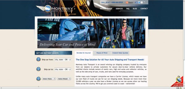
Montway Auto Transport provides a good example of using a form on their homepage. In fact, if you go through Montway’s pages you’ll see this form on every page. Generally you don’t want to overwhelm visitors on your site with a form on every page. Save some web real estate to provide the visitor information about your company to gain to their confidence. If you’d like to have the form on every page, you need to reduce the size and put it on the right or left of the text. This gives the visitor a chance to read a little about your company before they start filling out forms. Advertise the advantages of filling out the form in your headers and bold text. In Montway’s case, the form does not ask for any personal information. That is a bonus for visitors who are just browsing companies and not ready to pay or choose. But it’s not advertised anywhere on the page! Instead of ‘Get an Instant Quote’ is should read: No Obligation Quote, which will attract the visitors that are unsure or testing waters.
Decomposing & Re-composing Montway’s Form
Once a company decides they want a form to be on the homepage there are two very important factors that arise in the design. One is placement. Where is the form going to be on the homepage? How large will it be? How can one create emphasis without being visually ‘loud’ or pushy? Second is the actual design of the form. Does it look simple to fill out? Is the submit button clearly visible and above the fold? Does it look clean and part of the website? It is important to keep forms that appear on the homepage simple and unimposing. Make sure it has a clean design, easy to read, and easy to fill out.
Montway’s Form Placement:
It’s fine sitting on the left of the page, since it allows room for text, headers, and imagery and other elements that are important on a homepage. However, it is a little big. And worst of all the submit button is below the fold. That means the submit button is below where the window ends causing the visitor to have to scroll to send their information and receive a quote. Studies have shown that a large percentage of web users don’t scroll. Be very careful not to put important elements very near or below the bottom of the viewing window.
Montway’s Form Design:
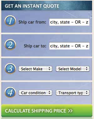
The biggest design faux pas on Montway’s calculator is the heading and button design. First, if it’s an anonymous form, advertise it! Instead of get an instant quote, write Get an Anonymous Quote. There are also a lot of things going on in the background of this form. It needs to look cohesive and clear. By simplifying the background and putting everything in a single ‘box’ the form will seem less imposing and clearer. The title of the form is in reverse color (white text) and all caps, which makes it hard to read on screen. It’s also seemingly crammed in that top blue bar. Create emphasis on the header by allowing more space around it. The button at the bottom is another issue. It looks a lot like the header since its spans across the entire form. Better to make it look like a button, once again by adding space and making the button smaller.
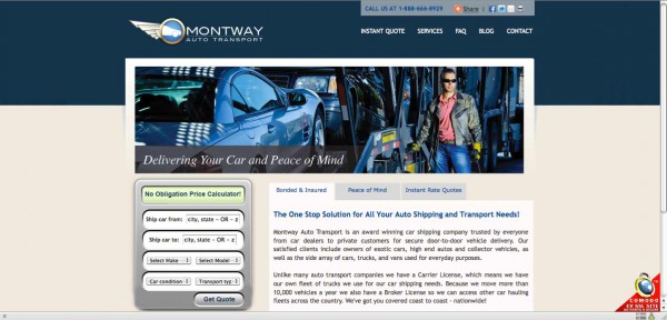
Here is quite visual re-design of the form for Montway’s Quote Calculator:
I removed the image from the header to show the impact of the calculator, without it competeing for attention with other elements on the page. Removing the image from the header also makes the entire page easier to look at and navigate.
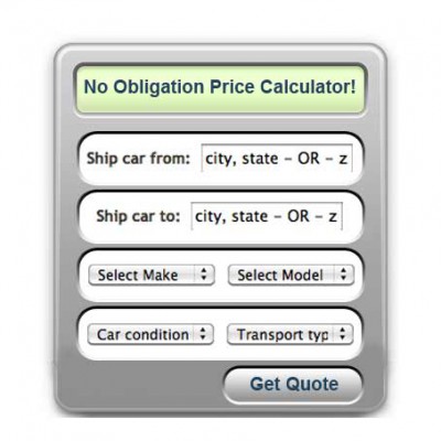
Close-up of form redesign:
Since the form is literally a price calculator, I thought I would play with the imagery and make the form actually look like a calculator. This is one way to make an item on your page stand out with using bold colors, big lettering, or other obstructive ways to create emphasis. A clever and distinct design can accomplish the same goal and actually encourage the visitor to participate.
Conclusion:
Once you decide that you need/want a form on the homepage consider how it will effect the design of your website. The homepage is the most important page on your website since its usually what a visitor sees first. First impressions will make or break your traffic. If a visitor thinks your website is cluttered, pushy, too bold, or requires you to fill out a form off the bat, they will most likely leave your site. Why do you think websites that require log-in and an account don’t have a big LOG IN form at the center of their home page? Because no one is going to give you information before they have an idea of what they are getting into. However forms are helpful on the homepage, because if someone is ready to fill it out they don’t need to click around. In Montway’s case it allows the visitor to see directly what it will cost them to ship their car. However, there should be time when then the user is asked to fill out their email. This form doesn’t serve Montway as much as the user since they have no way of contacting interested parties after they fill out the price calculator.

